Identity / Branding / Visual Identity / Graphic Design / Packaging
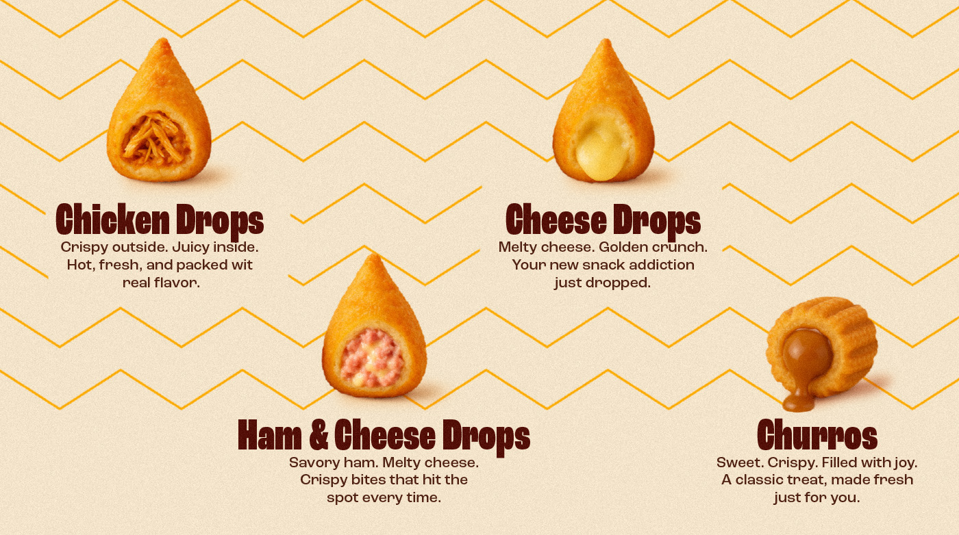
[PT-BR] A Smack & Snack é uma rede de fast-food especializada em oferecer sabor e praticidade pra quem não quer perder tempo. Uma experiência rápida, divertida e inesquecível, do primeiro olhar à última mordida.
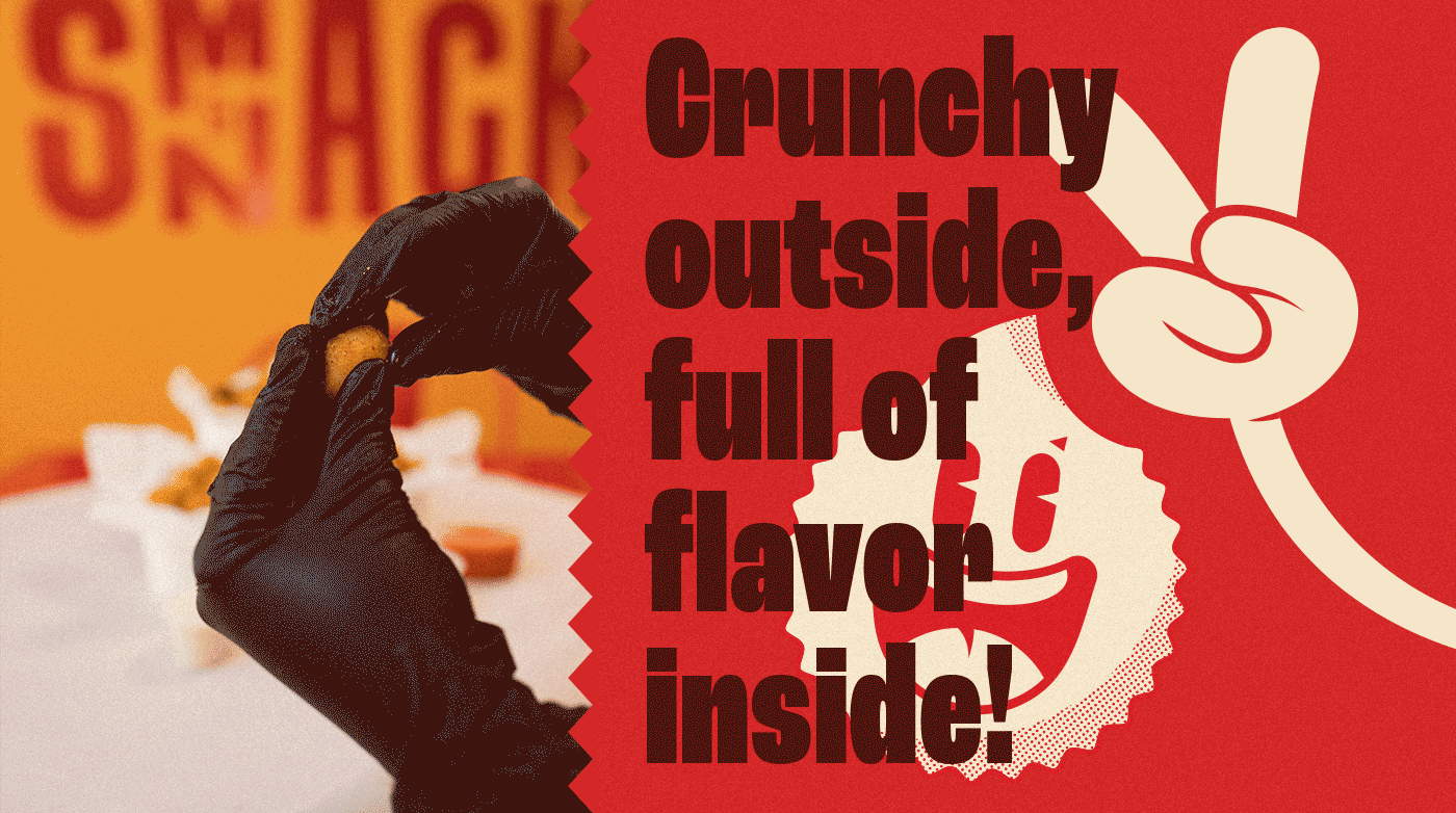
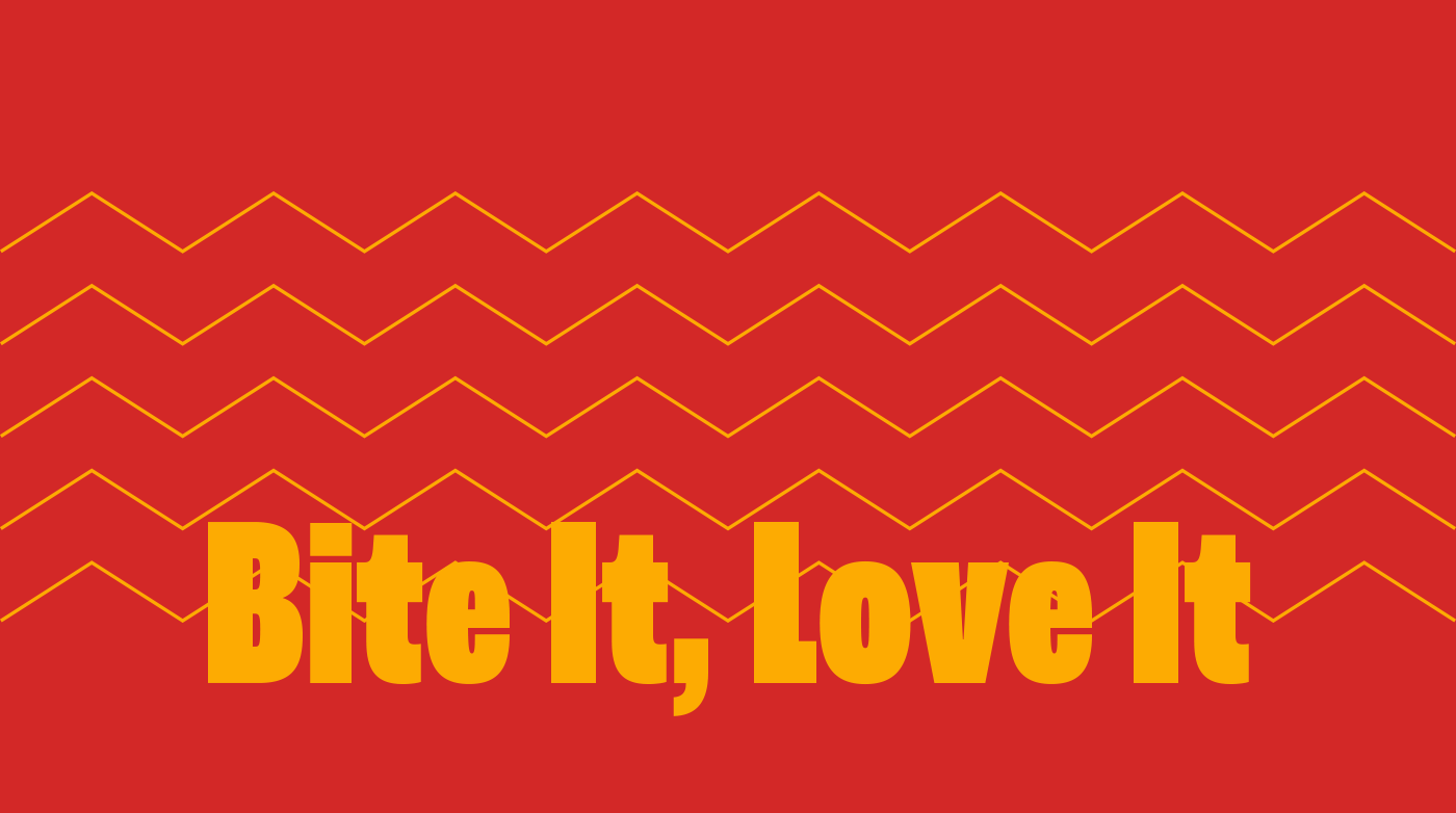
Traduzimos esse impacto e simplicidade em uma identidade visual direta, jovem e cheia de energia. A tipografia sem serifa em bold foi escolhida como ponto de partida, trazendo um visual limpo, de leitura rápida, que conversa com o dia a dia agitado do consumidor.
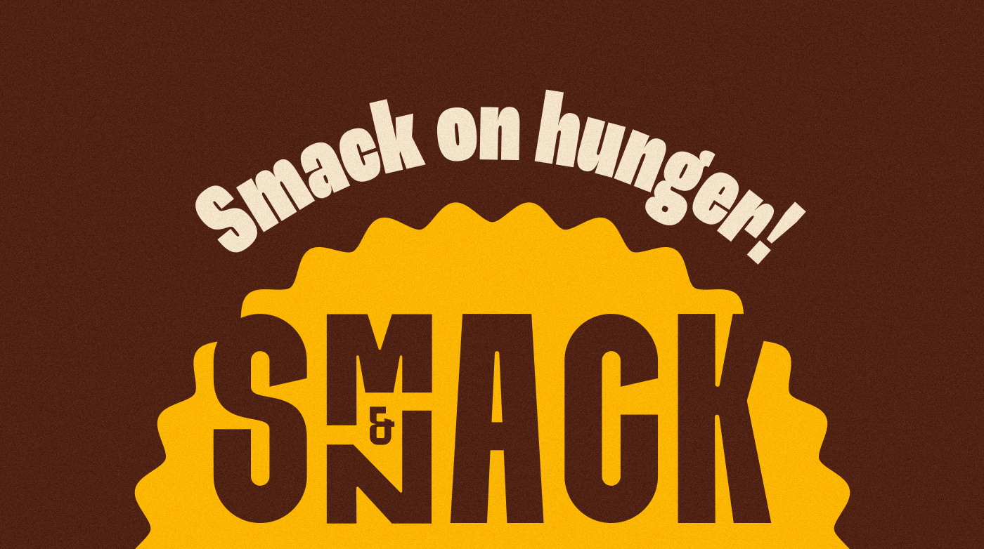
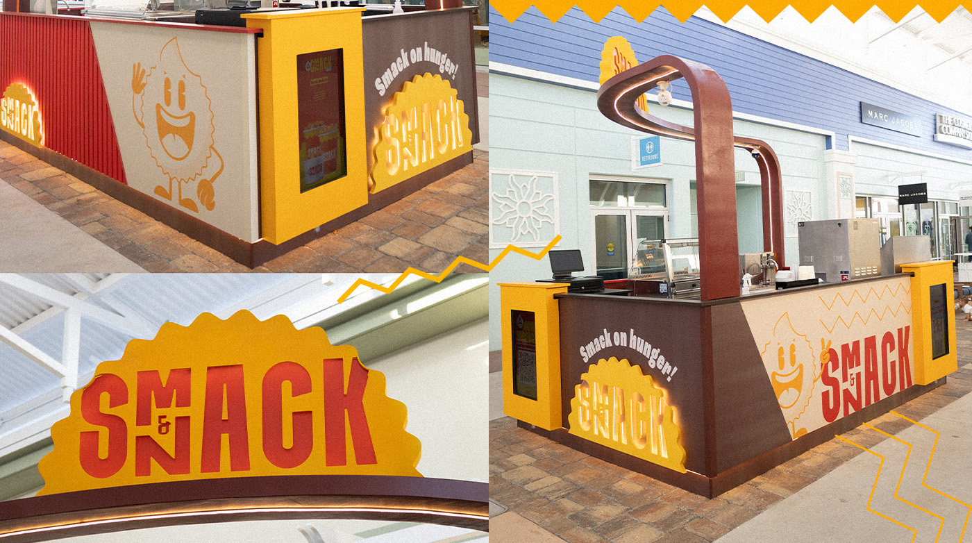
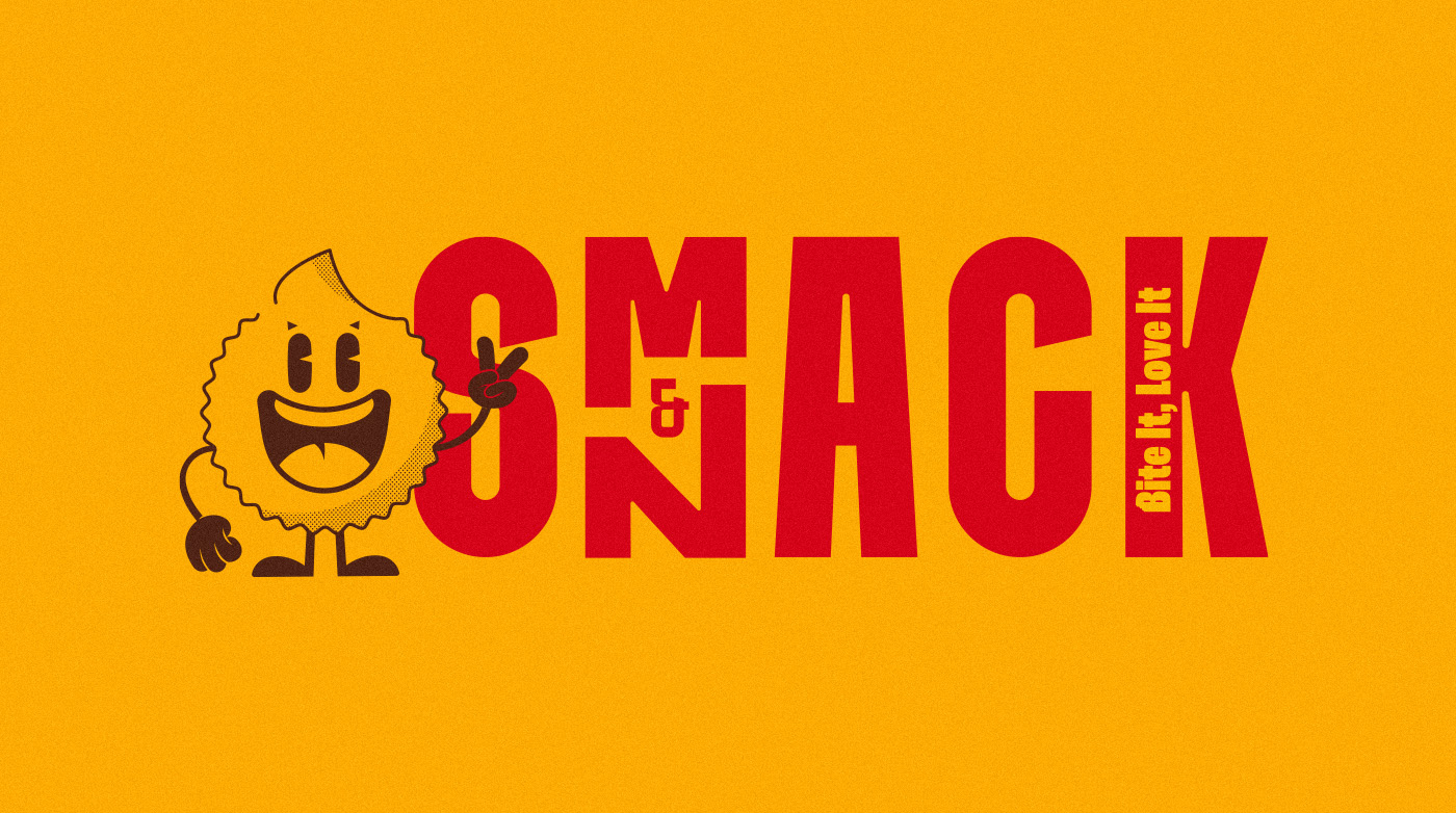
A grafia foi tratada como um diferencial estratégico: fundimos as palavras “Smack” e “Snack” em uma leitura contínua, com as letras N e M posicionadas verticalmente no mesmo espaço. Essa solução trouxe irreverência, gerou curiosidade e fortaleceu o reconhecimento visual da marca, principalmente em ambientes como shoppings e pontos de grande circulação.
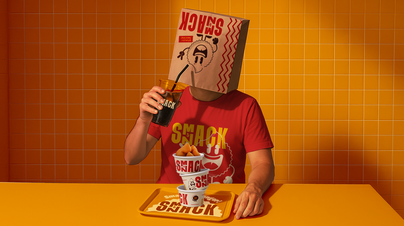
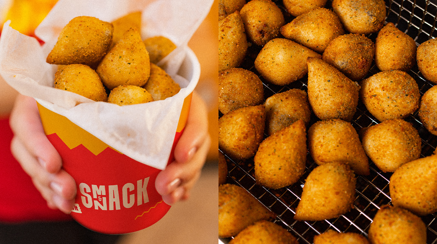
A paleta de cores vibrante foi pensada pra abrir o apetite. Tons contrastantes, como vermelho, amarelo e marrom, ajudam a destacar o produto e reforçam a proposta divertida e moderna da marca.
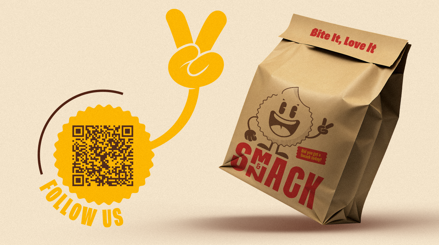
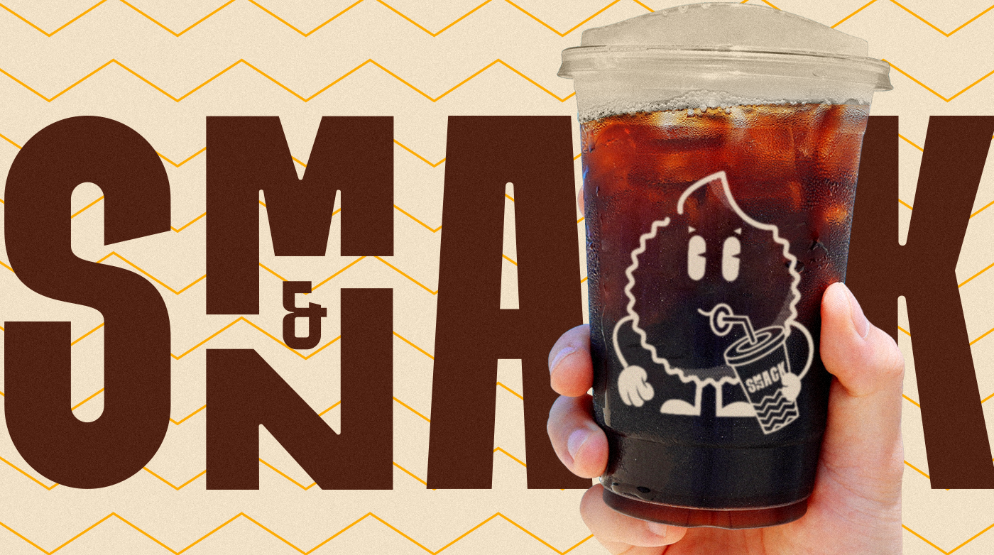
Como personagem principal da identidade, nasceu o Snakito, o mascote da Smack & Snack. Simpático e amigável, com uma boca gigante pronta pra morder qualquer Smack & Snack que aparecer pela frente. Ele sintetiza o espírito da marca: crocante, acessível e com muita personalidade.
[ENG] Smack & Snack is a fast-food chain that brings flavor and convenience to people who don’t want to waste time. A quick, fun, and unforgettable experience, from the first glance to the last bite.
We translated this sense of impact and simplicity into a visual identity that feels bold, youthful, and full of energy. A bold sans-serif typeface was chosen as the foundation, creating a clean and instantly readable look that fits the fast-paced lifestyle of our audience.
The brand name became a strategic visual feature. We merged the words “Smack” and “Snack” into a continuous reading, placing the N and M vertically in the same space. This solution added a playful twist, sparked curiosity, and strengthened the brand’s visual recognition, especially in high-traffic environments like malls and food courts.
The vibrant color palette was designed to stimulate the appetite. Contrasting tones like red, yellow, and brown help highlight the product and reinforce the brand’s fun and modern personality.
At the center of the identity is Snakito, the brand mascot. Friendly and expressive, with a giant mouth ready to bite into any Smack & Snack in sight, he captures the brand’s essence: crunchy, approachable, and full of personality.
Client: Smack & Snack
Creation: Karoline Rodrigues, Letra K
Flórida, EUA, 2025